
Global Earthquake Map (2000–2020)
🌋 Global Earthquake Map (2000–2020)
Visualizing Two Decades of Earthquake Fatalities with QGIS

Author: Souleymane Maman Nouri Souley
📝 Overview
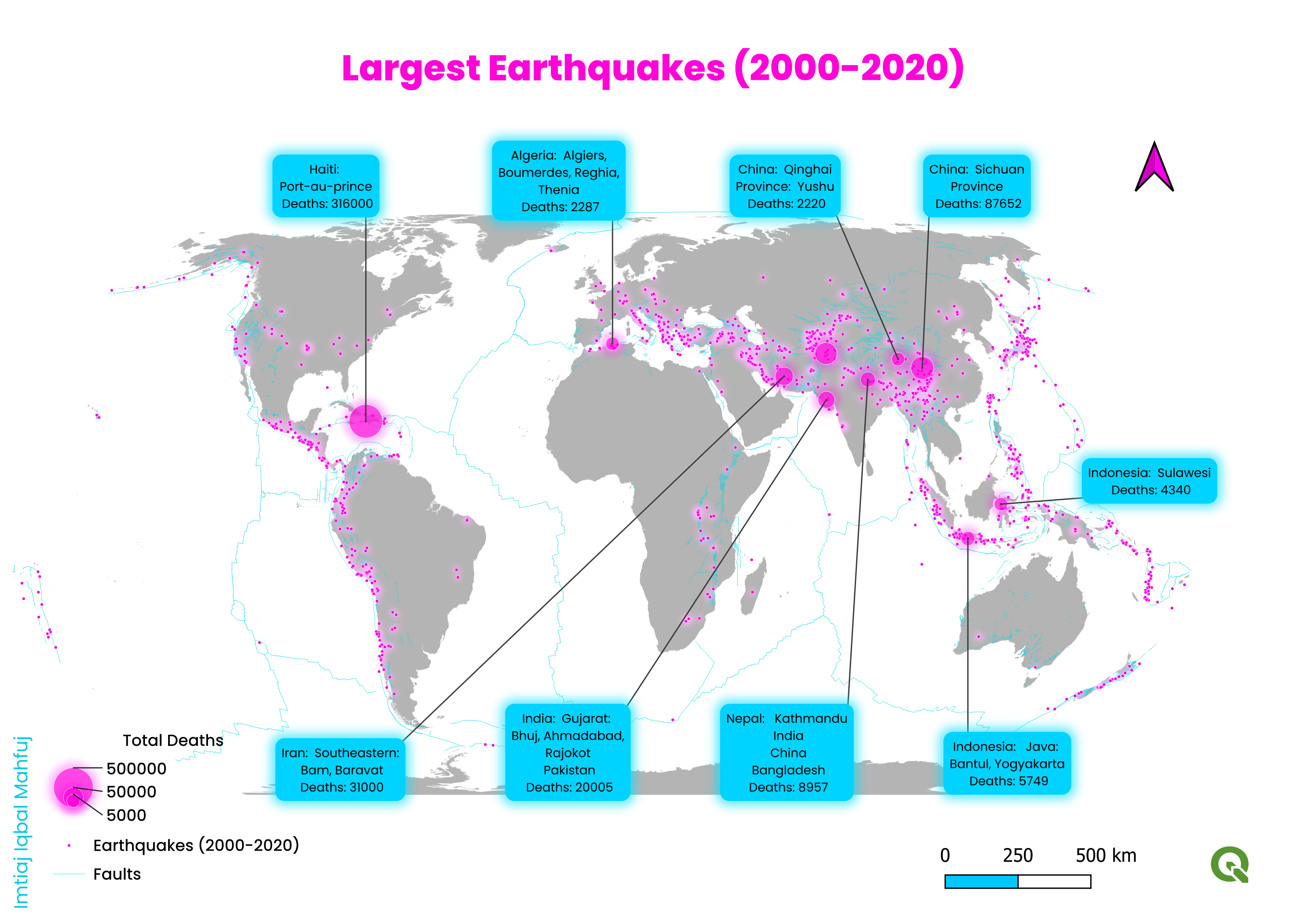
This project visualizes global earthquake fatalities from 2000 to 2020 using QGIS, marking my first experience working with this powerful open-source GIS platform. The goal was to transform raw global earthquake data into an insightful spatial representation of earthquake intensity and human impact.
Earthquakes have caused significant human and infrastructural losses over the past decades. By spatially analyzing where death tolls were highest, this map helps identify global hotspots that require urgent disaster management and preparedness planning.
The visualization highlights both high-impact regions (e.g., Asia-Pacific, South America) and moderate zones, providing an intuitive understanding of spatial distribution patterns of natural disasters.
This project aims to serve researchers, urban planners, and policymakers in improving disaster resilience and risk reduction strategies through spatial insights.
🛠️ Tools & Technologies
⚙️ Methodology
| Step | Description |
|---|---|
| 1. Data Collection | Global earthquake data from 2000–2020 (sourced from USGS / Global Earthquake Database) |
| 2. Preprocessing | Data cleaning and attribute filtering in QGIS |
| 3. Analysis | Visual classification based on number of deaths per event |
| 4. Visualization | Symbolized intensity using graduated color ramp (magenta = higher death toll) with basemap context |
📊 Results & Insights
- 🔹 Identified Asia-Pacific and South American regions as major earthquake hotspots.
- 🔹 Visualized death intensity distribution across decades.
- 🔹 Demonstrated how QGIS can effectively map and analyze large geospatial datasets.

Caption: Global Earthquake Fatalities (2000–2020) — darker regions indicate higher death counts.
❓ Why this project?
- To explore spatial distribution of earthquake fatalities globally.
- To learn and apply QGIS for geospatial visualization.
- To communicate risk zones and promote resilience planning through data-driven visuals.
✨ Features
- Easy-to-interpret global earthquake intensity map
- Graduated color ramp showing death count ranges
- Exportable as high-resolution image or PDF
- Created entirely using QGIS built-in tools (no external scripting required)
- Ideal for academic or professional reports
📎 Links
🔖 Tags
QGIS GIS Geospatial Analysis Earthquake Mapping Spatial Data Disaster Management Cartography
📌 Credits & Shoutouts
- 👨💻 Author: Souleymane Maman Nouri Souley
- 🙌 Inspiration: Special thanks to Ujaval Gandhi, Spatial Thoughts and the QGIS community for inspiring creative cartographic approaches.